Studio Joe Choi Studio Joe Choi

Flower Watchers

Rather than redesigning the brand from scratch, we began by asking a different question.

What is this project really becoming?

That question changed everything.
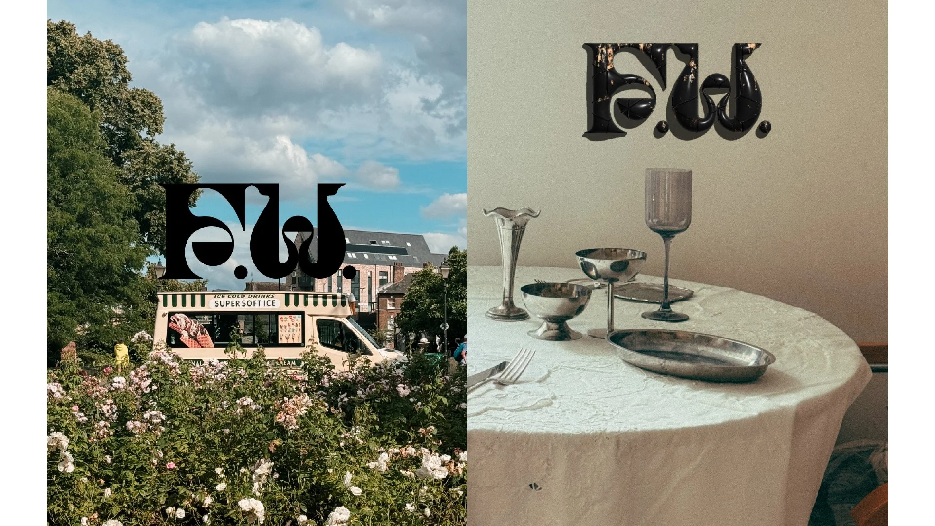
Building a brand that grew beyond flowers.

When Flower Watchers began, it was a small collaboration between florist Cherie and myself. We made dried flower arrangement tutorials, seasonal products and printed goods - simple things we enjoyed making together.

As the project grew, so did my role in shaping its identity. New products, photography and writing were emerging naturally, but they no longer felt connected by a single idea.

Rather than redesigning the brand from scratch, we began by asking a different question.

What is this project really becoming?

That question changed everything.

Looking for the Centre

The answer didn’t come from market research or mood boards.

It emerged through years of making, observing and talking about the work.

We realised that flowers were rarely the destination. They were how we entered conversations about places, memories, films, books and the overlooked details of everyday life.

Eventually, one sentence brought those threads together.

Flower Watchers is about noticing the world through flowers.

That became the organising idea for every design decision that followed.

Designing a System, Not Just an Identity

Once the centre became clear, the role of design also changed.

Instead of creating isolated graphics or promotional materials, the goal became building a system that could support different ways of noticing.

That shift reached every part of the project. The visual identity became quieter and more open. Photography moved beyond documenting floral arrangements and began observing flowers in everyday life. Writing became more conversational and reflective, while recurring studies gave different observations a shared structure. Products no longer existed simply because they could be made - they became responses to ideas that had already emerged through observation.

The brand wasn’t defined by a particular aesthetic.

It was defined by a shared way of looking.

A Brand That Can Continue Evolving

One of the biggest challenges with independent creative projects is that they often outgrow their original identity.

Rather than treating Flower Watchers as a finished brand, we designed it as a framework that could evolve alongside our interests.

Today it includes photography, writing, objects, field studies and seasonal products, while remaining recognisably the same practice.

Not because every output looks identical, but because every decision begins with the same question:

What have we noticed?

That question continues to guide the work today.

What this project taught me

Working on Flower Watchers changed how I think about branding.

Many branding projects begin by defining what a brand should become.

This project reminded me that sometimes the stronger approach is to recognise what it has already been becoming.

Once that organising idea becomes visible, design becomes less about inventing an identity and more about helping it express itself consistently.

Read More
Studio Joe Choi Studio Joe Choi

Printed Botanicals

I photograph flowers almost every day.

At first, there wasn’t much intention behind it. Walking to the station, passing a flower bed, noticing something on the pavement. Sometimes it was because of Flower Watchers. Sometimes I simply liked the way the light fell on a petal.

After a while, I realised I had stopped photographing flowers.

I was photographing shapes.
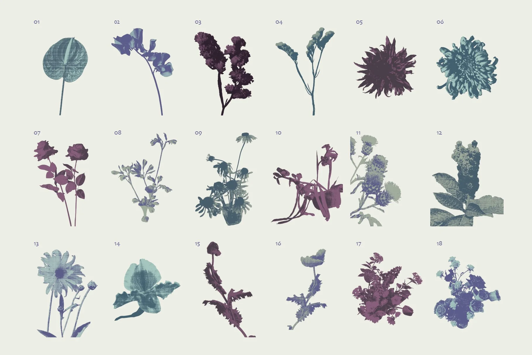
A study in transforming botanical photography into editorial graphics.

It started as a habit.

I photograph flowers almost every day.

At first, there wasn’t much intention behind it. Walking to the station, passing a flower bed, noticing something on the pavement. Sometimes it was because of Flower Watchers. Sometimes I simply liked the way the light fell on a petal.

After a while, I realised I had stopped photographing flowers.

I was photographing shapes.

I was paying attention to the way a stem divided a frame, how leaves overlapped each other, how a flower almost disappeared when photographed too closely. The more I looked, the less they felt like botanical photographs and the more they began to feel like raw material.

Looking differently

When I began selecting images for this project, I wasn’t searching for the most beautiful flowers.

I found myself choosing photographs that felt slightly unfamiliar.

Some were cropped so tightly they became almost abstract. Others had awkward compositions or unusual silhouettes. I liked the photographs that didn’t immediately tell you what you were looking at.

Ambiguity makes an image more generous.

Instead of describing one particular flower, it leaves room for interpretation. It becomes something a designer can work with instead of simply look at.

When flowers become graphic elements

Cutting each flower out was only the beginning.

The interesting part came afterwards.

Once they were removed from their original surroundings, they no longer belonged to a particular place or season. They became independent forms that could be rearranged, layered and combined with each other.

I wasn’t trying to compose finished posters.

I was looking for relationships.

Some arrangements felt too careful. Others felt unexpectedly alive. I kept moving the pieces around until they began to suggest a language rather than individual compositions.

Designing the language

The flowers naturally carried a softness that reminded me of printed publications.

Instead of making them feel decorative, I wanted to push them towards something quieter and more tactile.

Halftone textures softened the edges.

Layered grain introduced imperfections.

A restrained colour palette held everything together without asking for attention.

None of these decisions were made in isolation. Each one existed to support the same feeling - a visual language that felt editorial, collected and slightly timeless.

Rather than creating another botanical asset pack, I wanted to build something that designers could use to create their own books, posters, branding, packaging or presentations while still leaving room for their own interpretation.


What remained

Looking back, I don’t think Printed Botanicals is really about flowers.

It’s about what happens when you spend enough time looking at something familiar that it slowly becomes something else.

The flowers became shapes.

The photographs became graphic elements

A collection gradually became a visual language.

Printed Botanicals is simply the result of that way of looking.

Read More
Studio Joe Choi Studio Joe Choi

Yujo Yakitori

When a friend asked me to create the identity for her new yakitori restaurant, I thought I’d begin where I usually do—looking at graphic references.

Instead, I found myself looking almost entirely at the food.

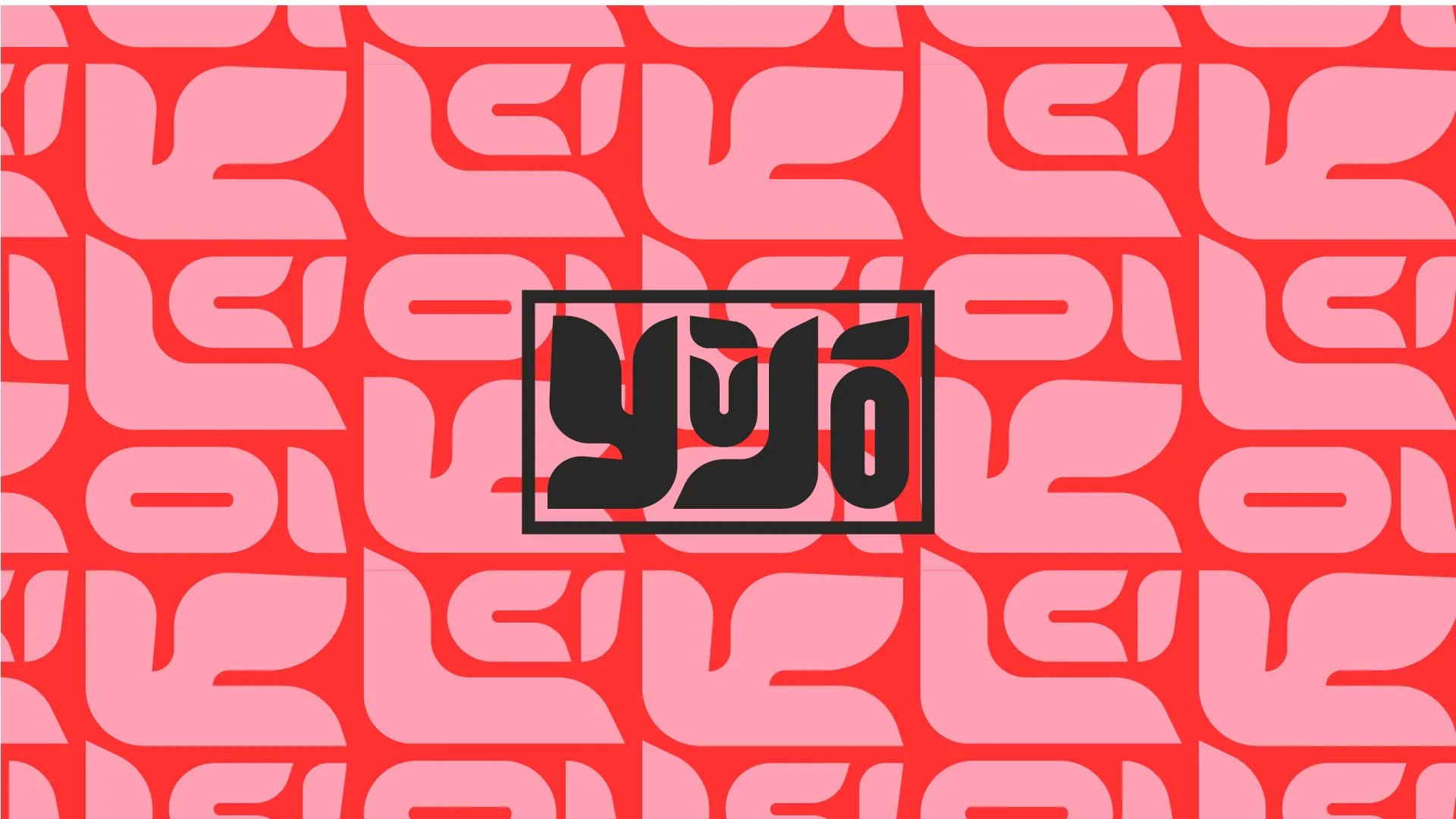
A brand identity for a modern yakitori restaurant in Wan Chai, Hong Kong.

First Impressions

When a friend asked me to create the identity for her new yakitori restaurant, I thought I’d begin where I usually do—looking at graphic references.

Instead, I found myself looking almost entirely at the food.

Not to copy how other restaurants looked, but to understand what kind of place Yujo wanted to become. I looked through traditional yakitori bars, modern restaurants, neighbourhood izakayas and contemporary dining spaces. Some felt refined. Some felt awkward. Some felt loud. Others felt quietly familiar.

After a while, I realised I wasn’t really studying restaurants anymore.

I was paying attention to three things:

  • the people

  • the shapes

  • the atmosphere

Those became the three lenses through which I understood the brand.

Three Things I Couldn’t Ignore

Originally, I thought I was searching for a visual style.

What I was actually searching for was the centre of the experience.

The people revealed how social the restaurant should feel.

The shapes hinted at a visual language that could feel generous, tactile and full of movement.

The atmosphere determined whether the identity should feel premium, playful, intimate or energetic.

Instead of one direction, these observations naturally grew into three creative territories.

Neon Soul explored the city’s nightlife and energy.

Bold Bites celebrated the physicality of the food and the joy of sharing it.

Modern Ritual looked at Japanese dining traditions through a quieter, more contemporary lens.

One Idea, Many Decisions

After discussing the concepts with the client, Bold Bites immediately felt like the right home for Yujo.

Everything afterwards became much easier.

Instead of designing individual assets, every decision came from one central idea.

The typography became chunky and expressive, inspired by the confidence of brush strokes but softened into something more approachable.

Simple geometric forms echoed skewers, sake cups and grilled ingredients without becoming literal illustrations.

Bright colour blocking created energy without relying on decorative Japanese clichés.

The system was designed to feel social before it felt premium.

Whether it appeared on menus, coasters, staff T-shirts or Instagram posts, it should feel like the same place inviting people to sit down, order another round and stay a little longer.


Beyond the Logo

The final identity extended well beyond a logo.

It became a visual language that could move across every touchpoint of the restaurant—from menus and business cards to merchandise, signage, social media and printed materials.

Rather than decorating the restaurant, the identity helped define its personality: warm, confident, slightly playful, and built around the experience of gathering over good food.

Afterwards

This project reminded me that I rarely find ideas by looking at design.

I find them by paying attention.

The strongest creative direction usually isn’t hidden inside mood boards or trend reports. It’s already present in the business itself—you just have to notice what keeps pulling your attention.

For Yujo, it wasn’t the logo that came first.

It was the people sitting around the table.

Read More