

JA! Cocktails
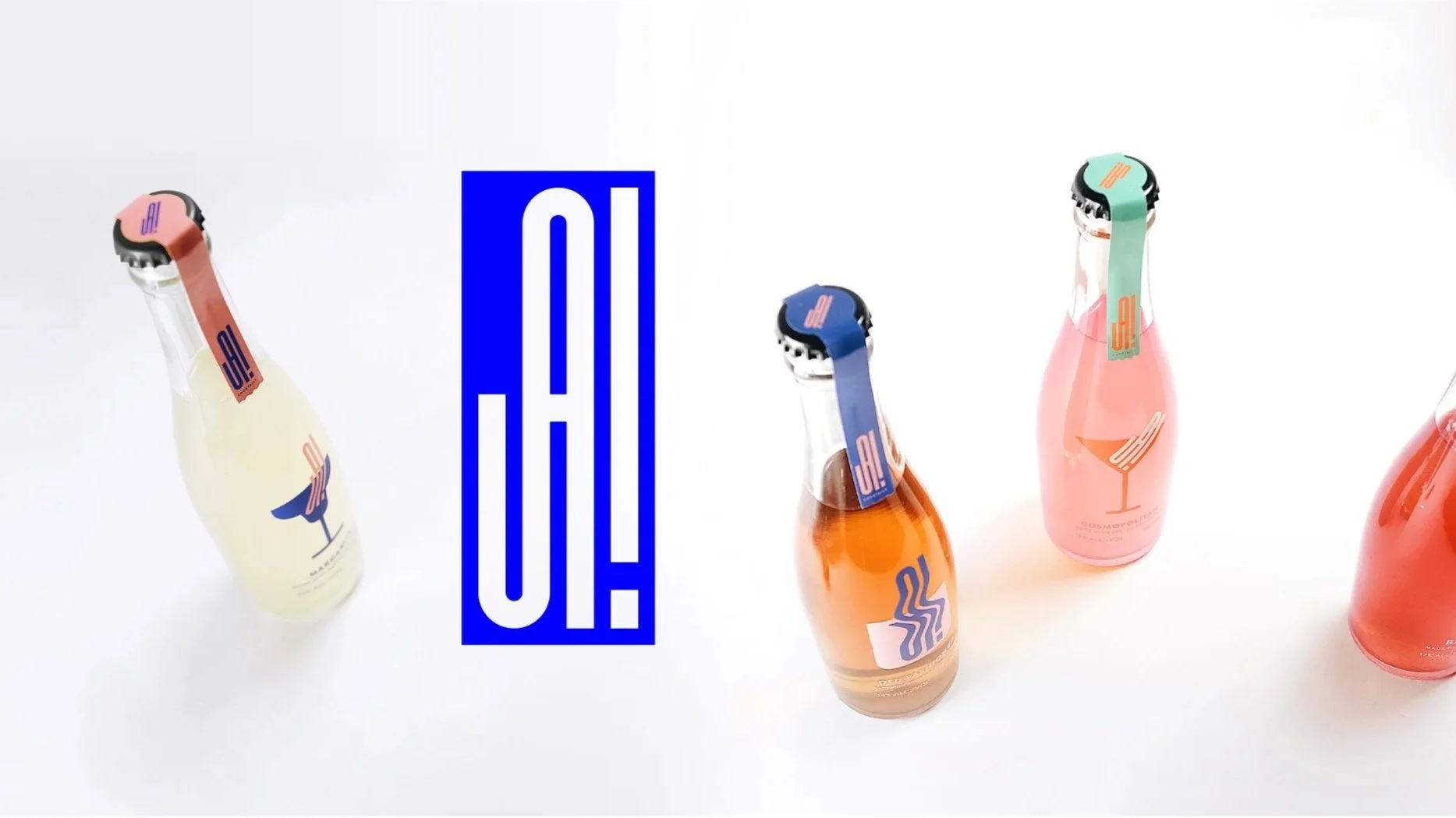
Bringing the Bar With You
Before ready-to-drink cocktails became a crowded category, a friend and I wondered if they could be something more than convenience.
We wanted to create bottled cocktails that felt closer to ordering a proper drink at a favourite bar—something carefully made, but easy enough to enjoy wherever the evening happened to begin.
The challenge wasn’t simply to package cocktails. It was to package the feeling that came with them.


Designing for the Mood
Cocktails occupy a space of their own.
They feel more celebratory than beer, but less formal than champagne. Ordering one usually suggests the night is only just beginning.
That optimism became the starting point for the identity.
Rather than borrowing visual language from spirits or premium beverages, the brand was built around the anticipation of going out—the energy, spontaneity and slight unpredictability that comes before the evening unfolds.

An Identity That Could Lose Its Balance
Instead of treating the logo as something fixed, I designed it as a form that could shift.
The identity stretched to fit different cocktail glasses, distorted across layouts and occasionally drifted out of alignment, almost as though the viewer was beginning to see the world through slightly blurred eyes.
The illustrations, motion and campaign language all followed the same idea. Rather than describing cocktails, they tried to recreate the playful atmosphere that surrounds them.
The system became less about consistency than personality.
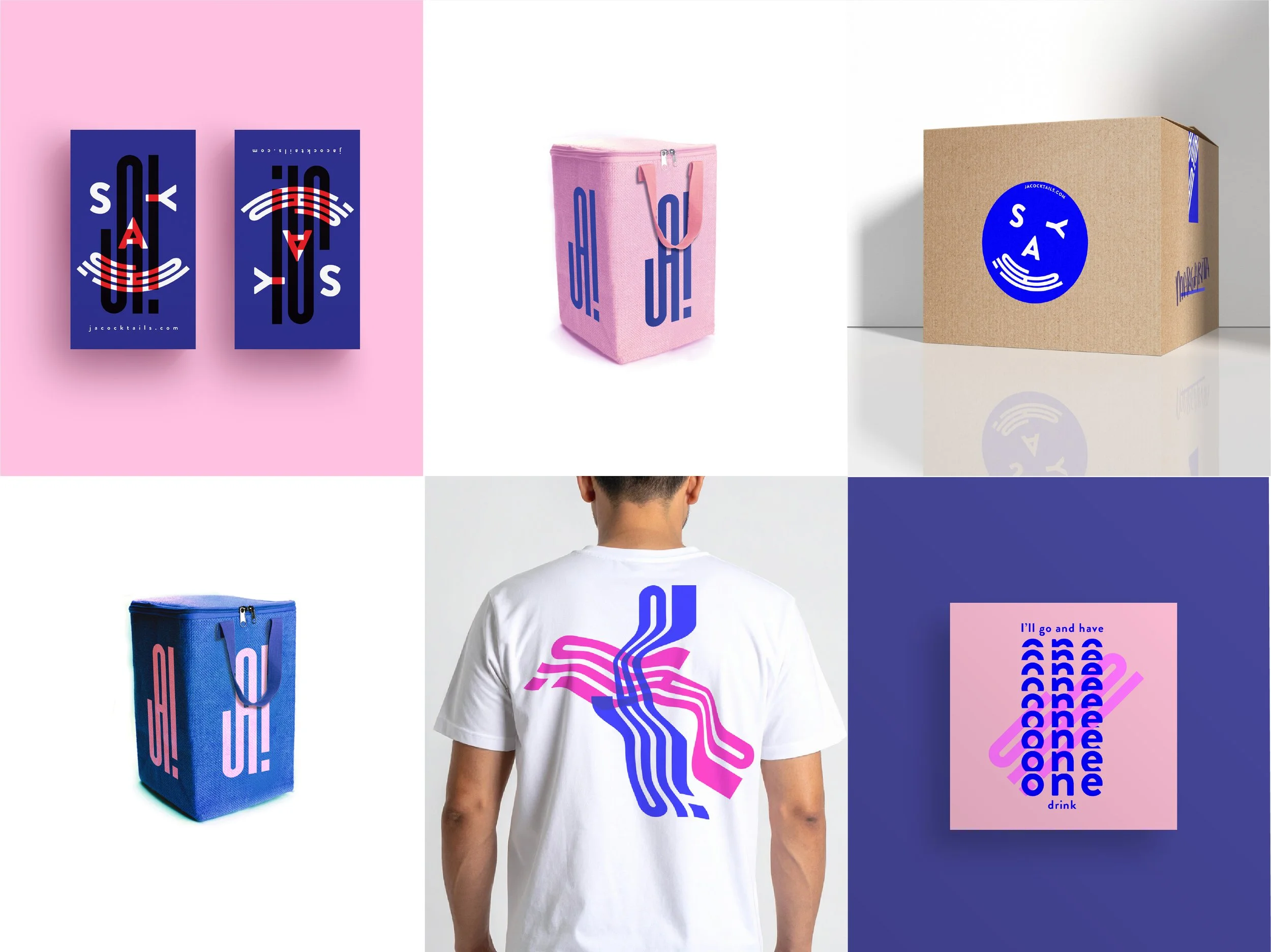

Beyond the Bottle
Although the brand never became a long-term business, it quickly grew beyond packaging.
We collaborated with bars, events and creative partners, giving the identity opportunities to exist in the environments that had inspired it in the first place.
Watching people interact with the brand during those evenings confirmed something I hadn’t fully understood when the project began: branding isn’t only about how something looks. It’s also about how it shapes the mood of a room.

Looking Back
JA! Cocktails eventually came to an end, but the project still feels surprisingly alive.
Looking back now, I’m less interested in the bottles than in the energy the identity carried. It reminds me that a visual system can do more than identify a product. At its best, it can capture a feeling people recognise before they even know why.