

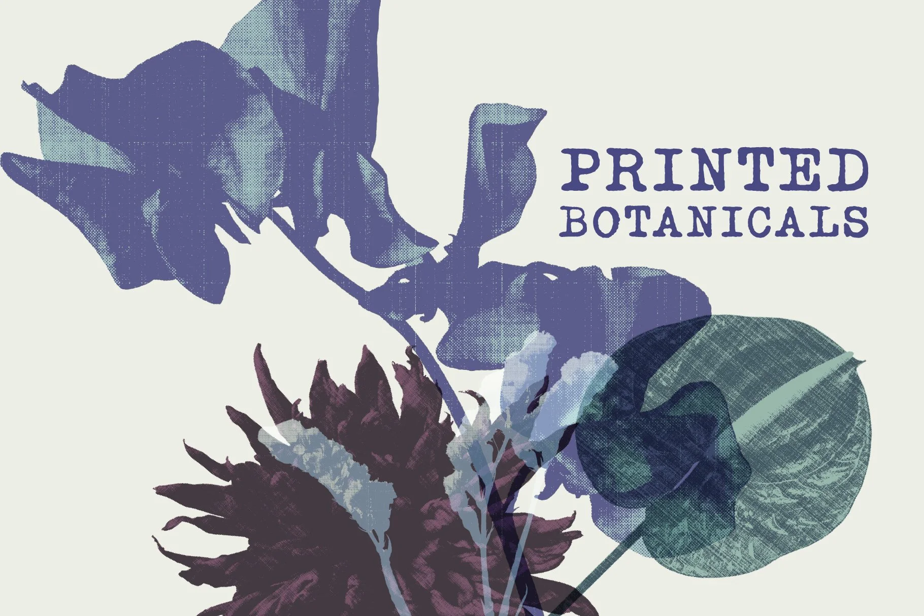
Printed Botanicals
A study in transforming botanical photography into editorial graphics.
It started as a habit
I photograph flowers almost every day.
At first, there wasn’t much intention behind it. Walking to the station, passing a flower bed, noticing something on the pavement. Sometimes it was because of Flower Watchers. Sometimes I simply liked the way the light fell on a petal.
After a while, I realised I had stopped photographing flowers.
I was photographing shapes.
I was paying attention to the way a stem divided a frame, how leaves overlapped each other, how a flower almost disappeared when photographed too closely. The more I looked, the less they felt like botanical photographs and the more they began to feel like raw material.
Looking differently
When I began selecting images for this project, I wasn’t searching for the most beautiful flowers.
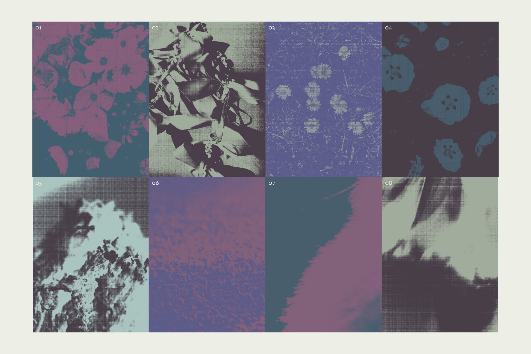
I found myself choosing photographs that felt slightly unfamiliar.
Some were cropped so tightly they became almost abstract. Others had awkward compositions or unusual silhouettes. I liked the photographs that didn’t immediately tell you what you were looking at.
Ambiguity makes an image more generous.
Instead of describing one particular flower, it leaves room for interpretation. It becomes something a designer can work with instead of simply look at.
When flowers become graphic elements
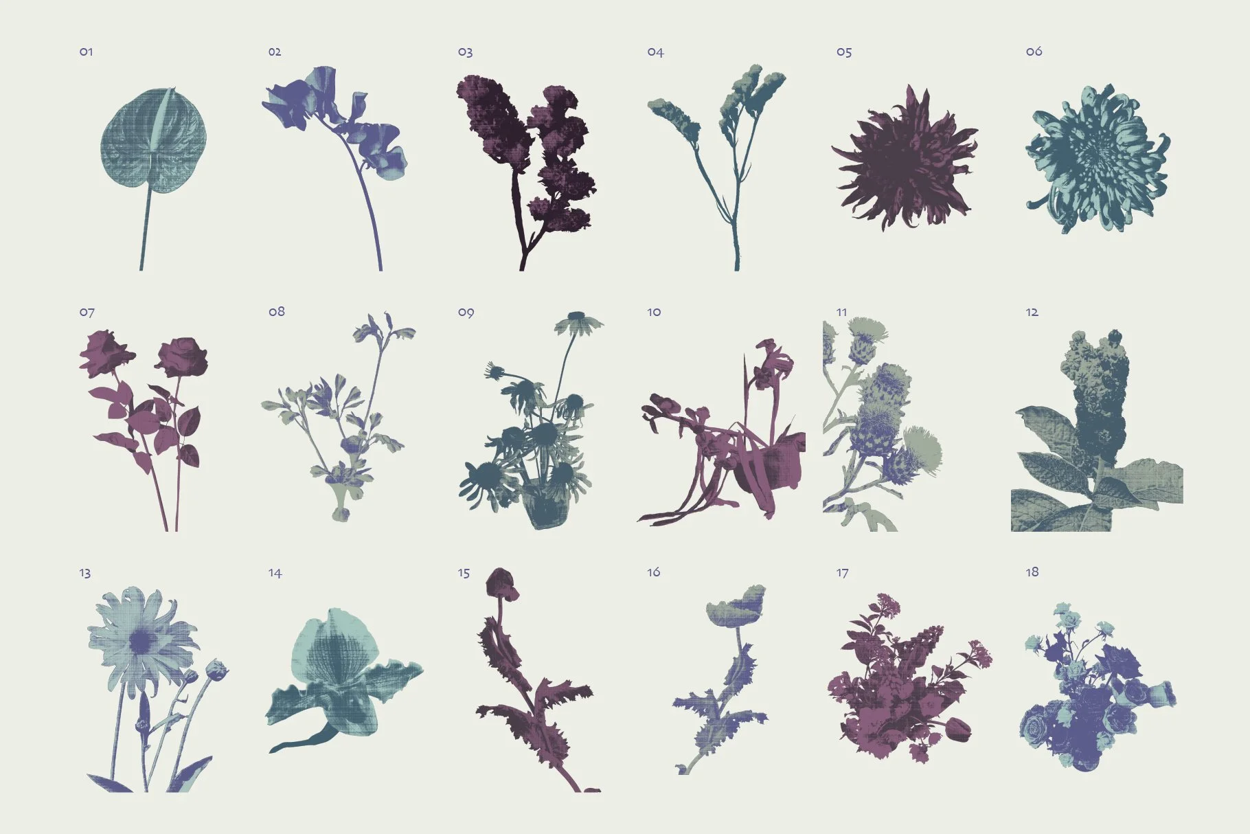
Cutting each flower out was only the beginning.
The interesting part came afterwards.
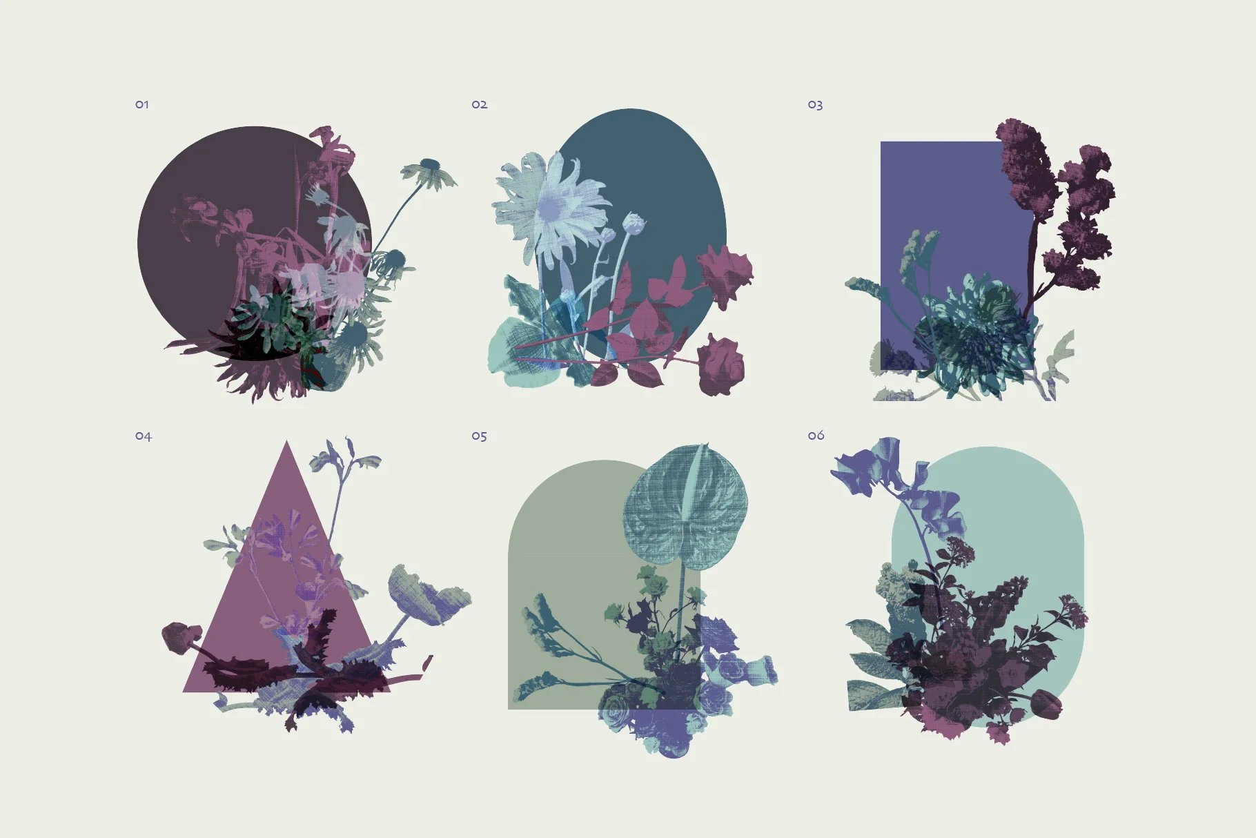
Once they were removed from their original surroundings, they no longer belonged to a particular place or season. They became independent forms that could be rearranged, layered and combined with each other.
I wasn’t trying to compose finished posters.
I was looking for relationships.
Some arrangements felt too careful. Others felt unexpectedly alive. I kept moving the pieces around until they began to suggest a language rather than individual compositions.
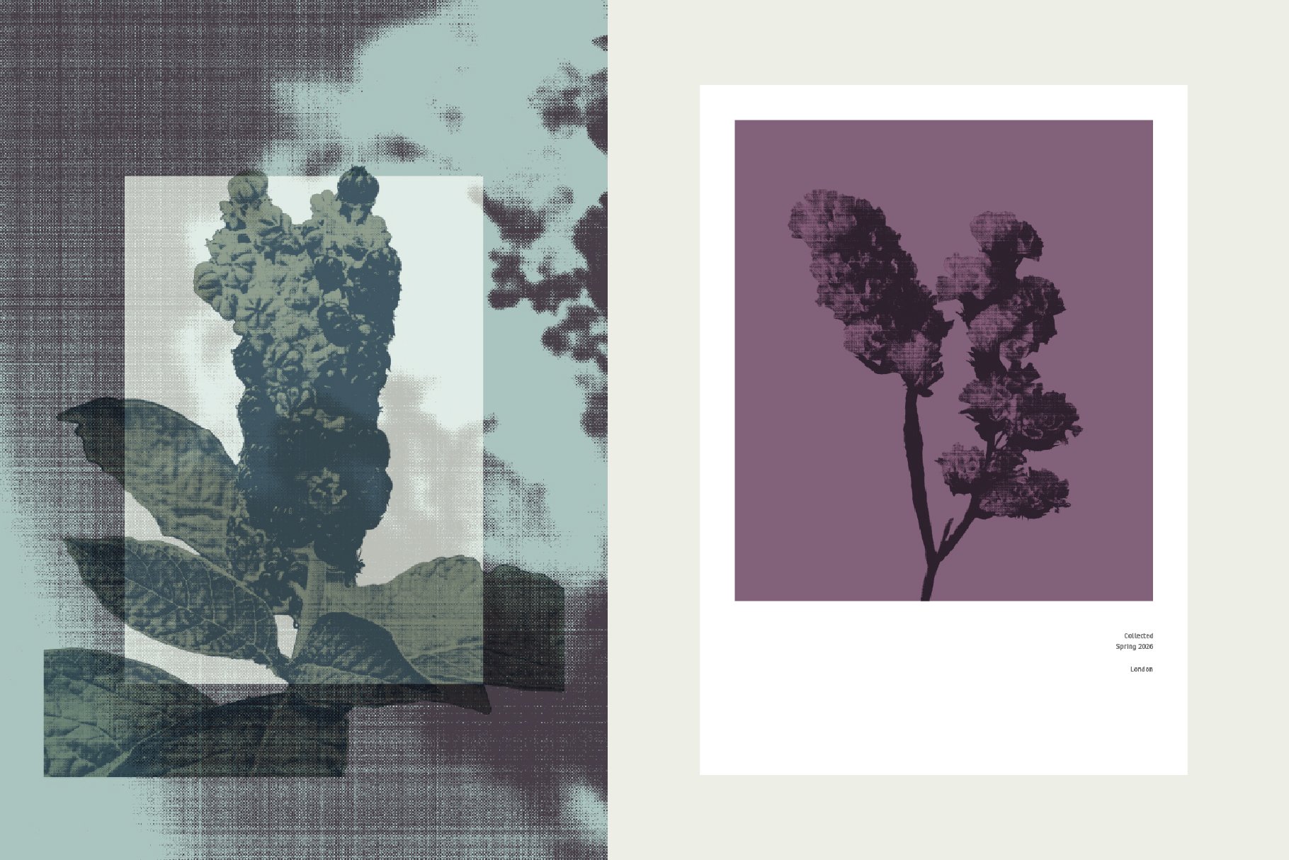
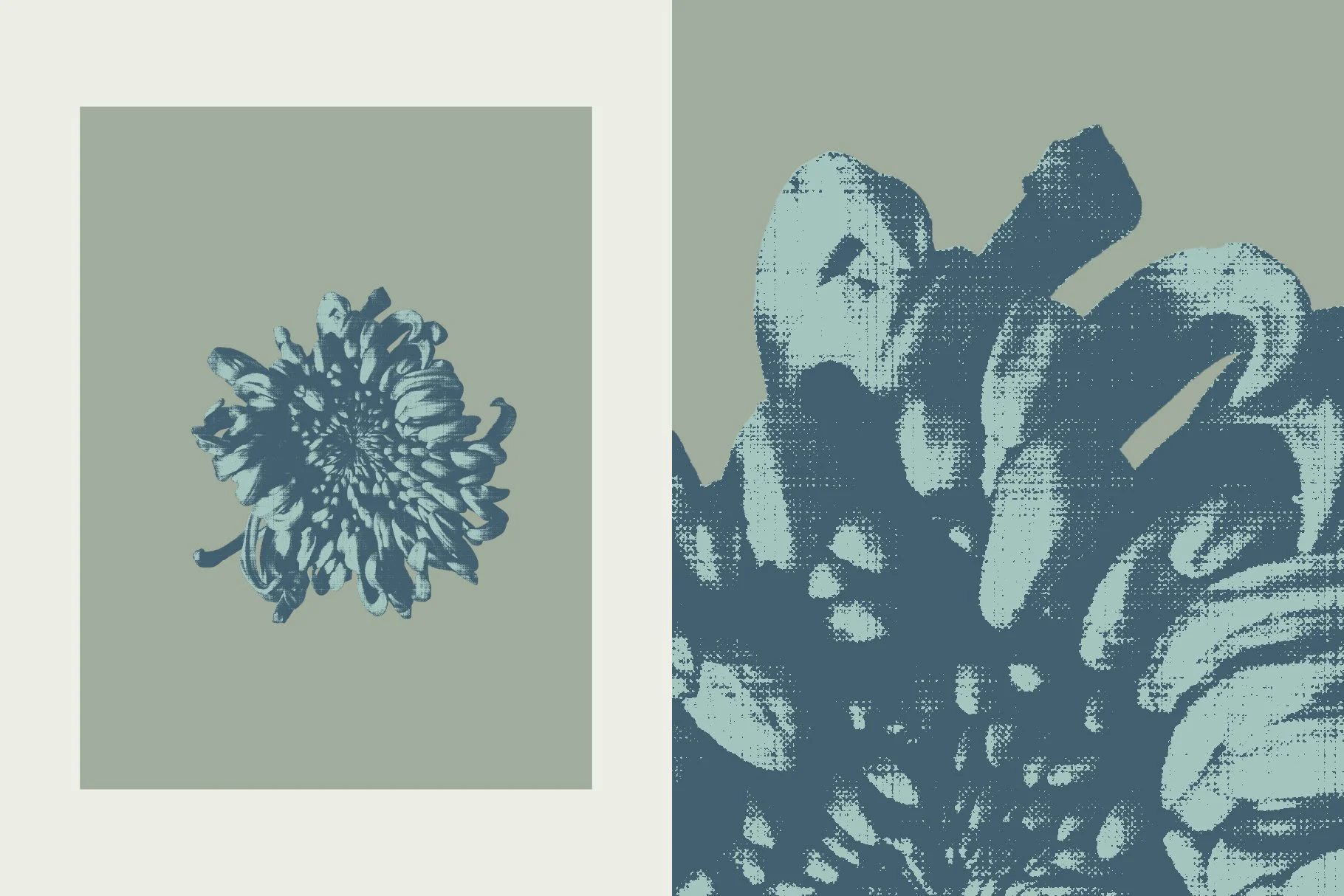
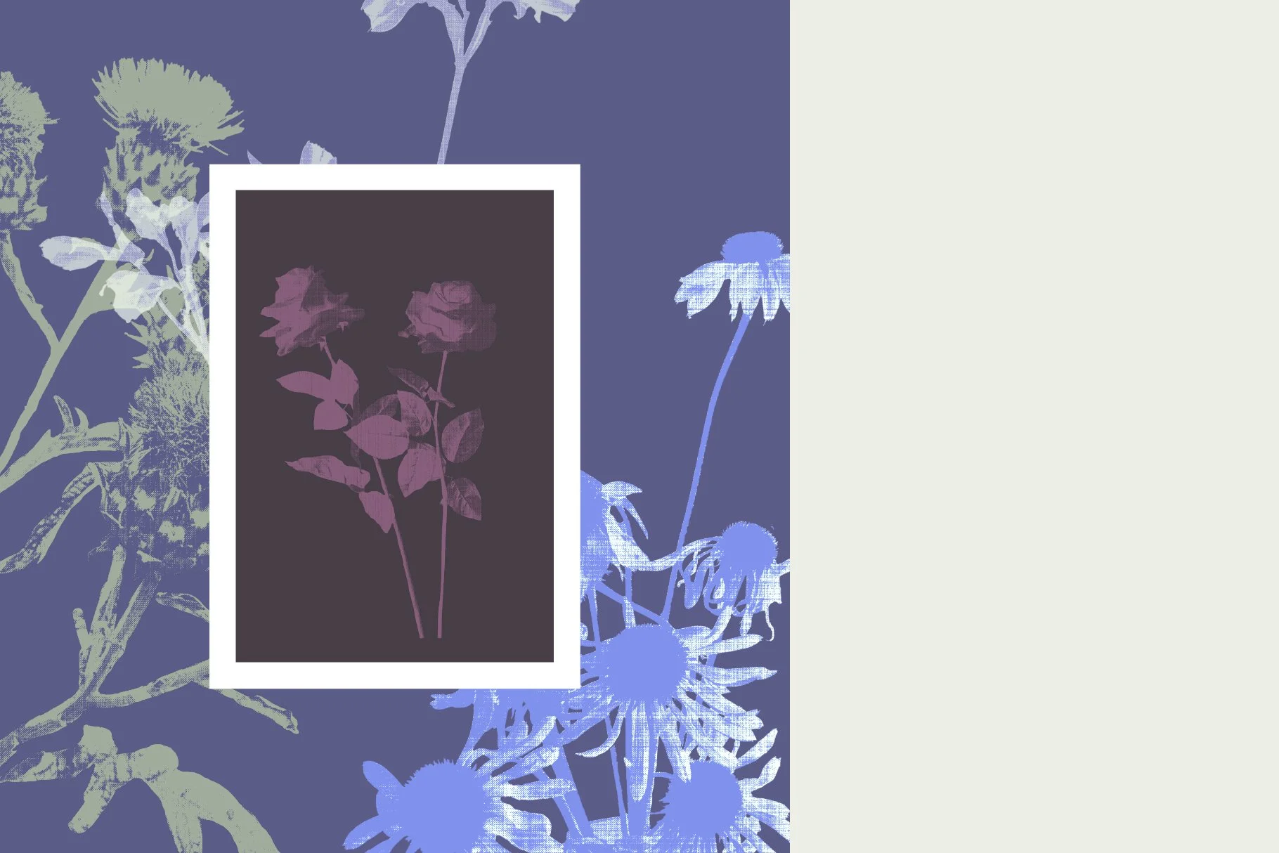
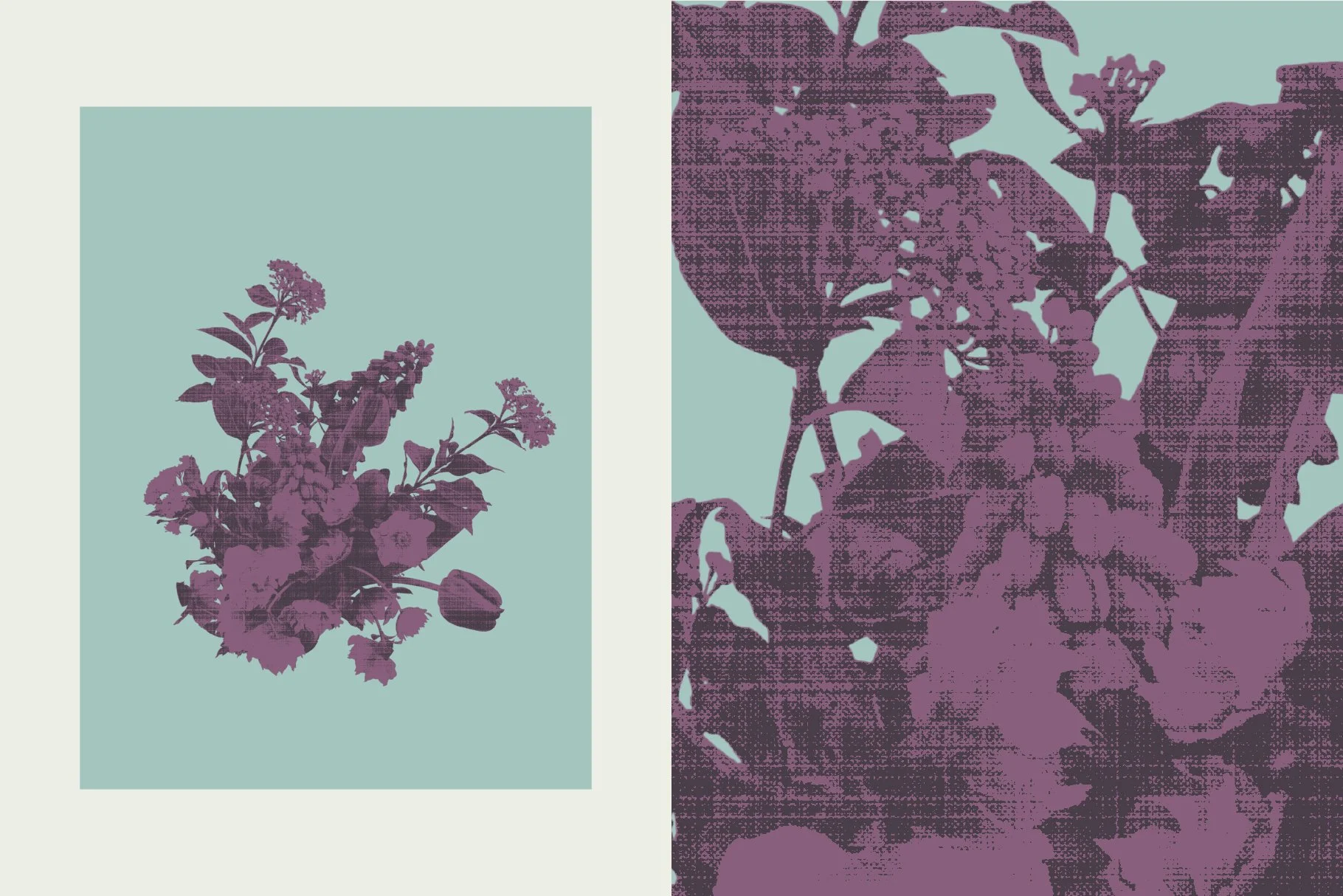
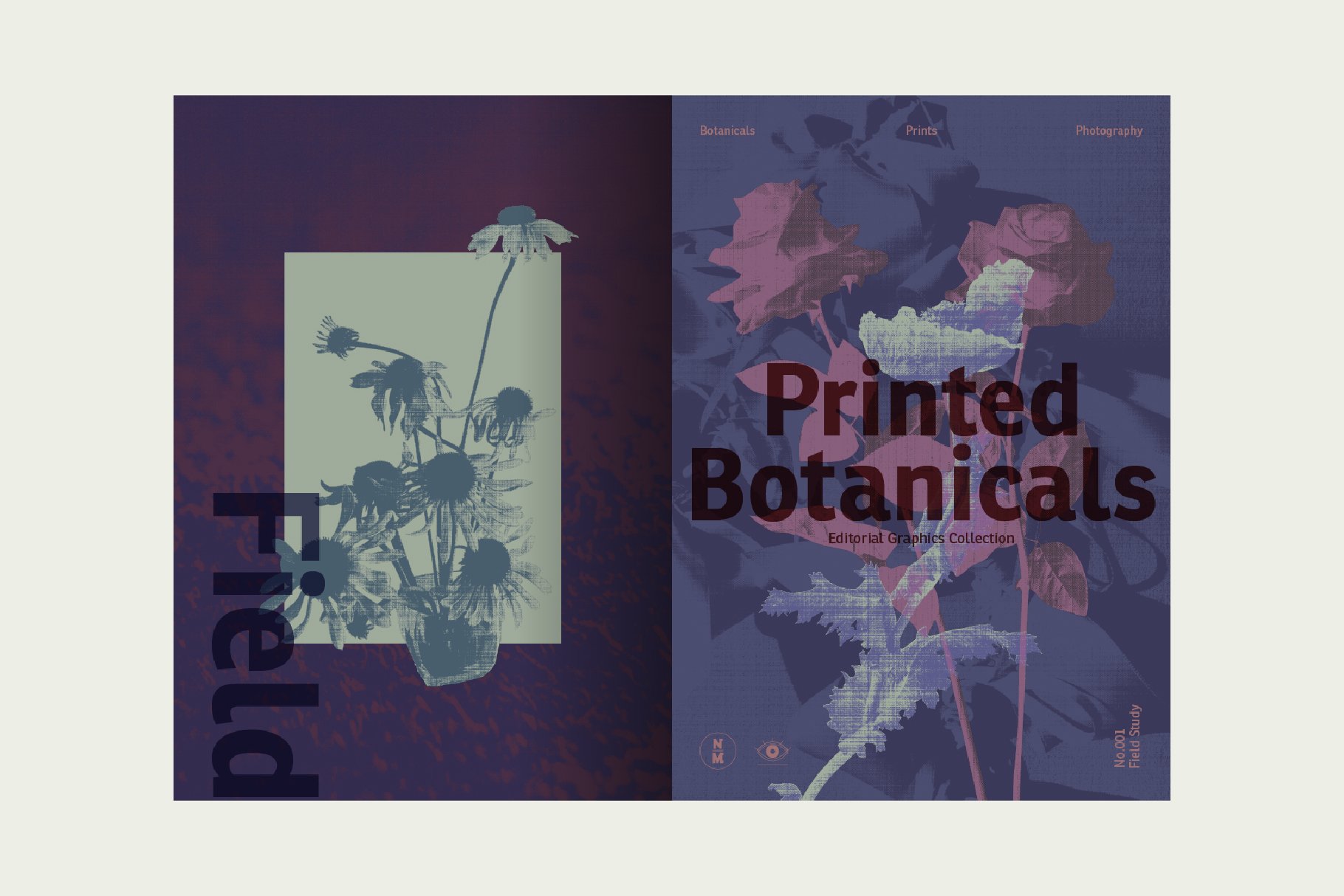
The flowers naturally carried a softness that reminded me of printed publications.
Instead of making them feel decorative, I wanted to push them towards something quieter and more tactile.
Halftone textures softened the edges.
Layered grain introduced imperfections.
A restrained colour palette held everything together without asking for attention.
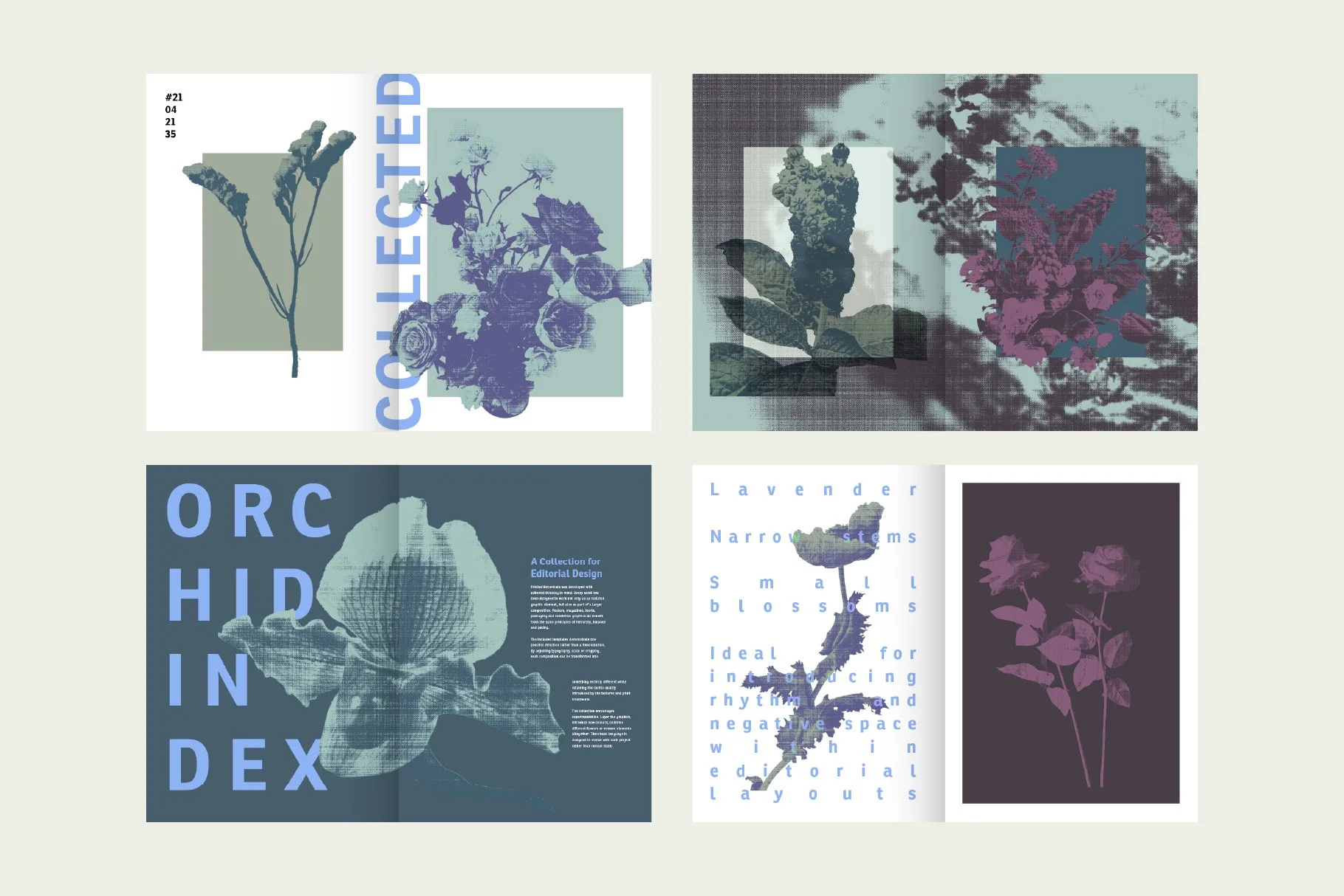
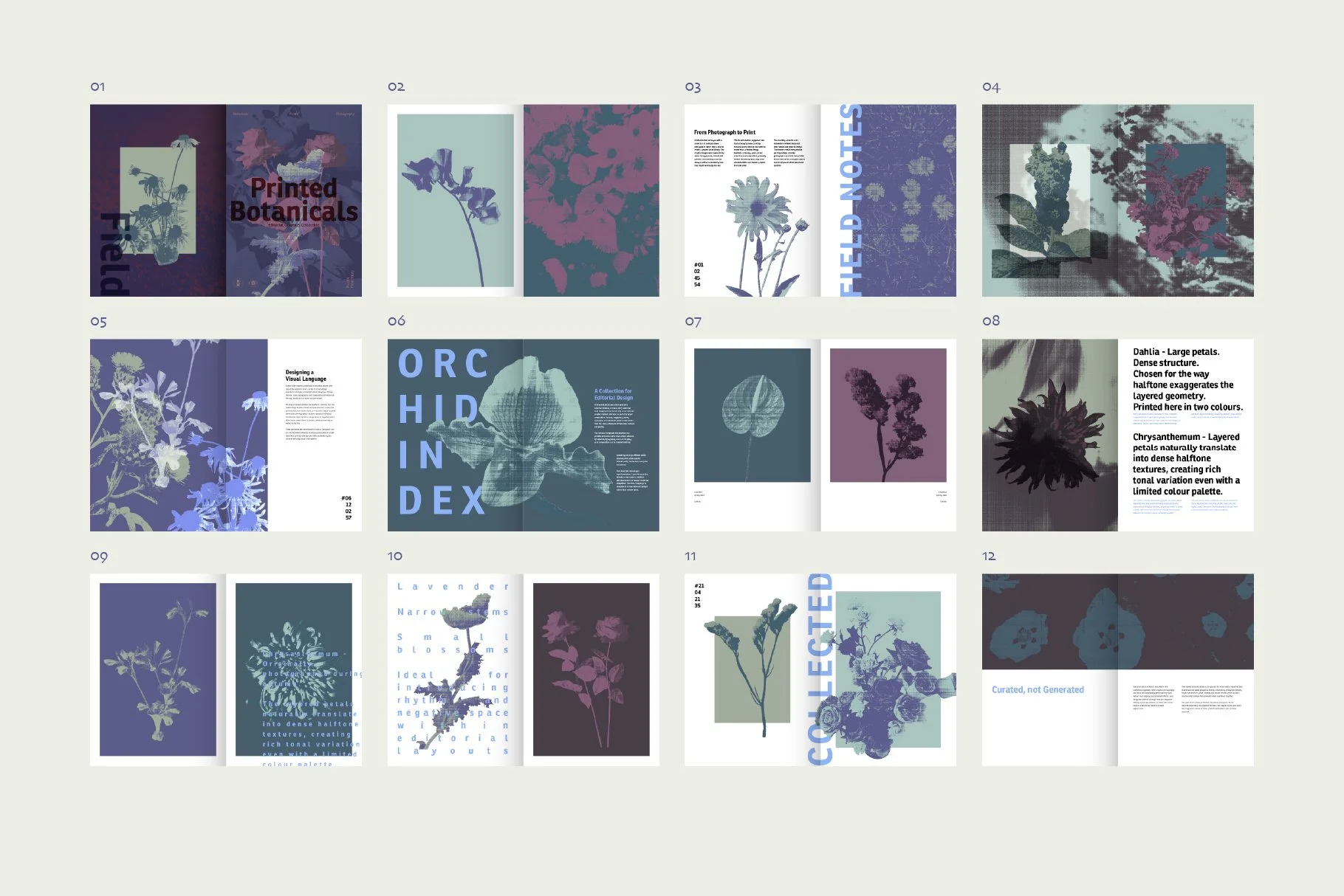
None of these decisions were made in isolation. Each one existed to support the same feeling - a visual language that felt editorial, collected and slightly timeless.
Rather than creating another botanical asset pack, I wanted to build something that designers could use to create their own books, posters, branding, packaging or presentations while still leaving room for their own interpretation.
Designing the language
What remained
Looking back, I don’t think Printed Botanicals is really about flowers.
It’s about what happens when you spend enough time looking at something familiar that it slowly becomes something else.
The flowers became shapes.
The photographs became graphic elements.
A collection gradually became a visual language.
Printed Botanicals is simply the result of that way of looking.