

Yujo Yakitori
A brand identity for a modern yakitori restaurant in Wan Chai, Hong Kong.
First Impressions
When a friend asked me to create the identity for her new yakitori restaurant, I thought I’d begin where I usually do—looking at graphic references.
Instead, I found myself looking almost entirely at the food.
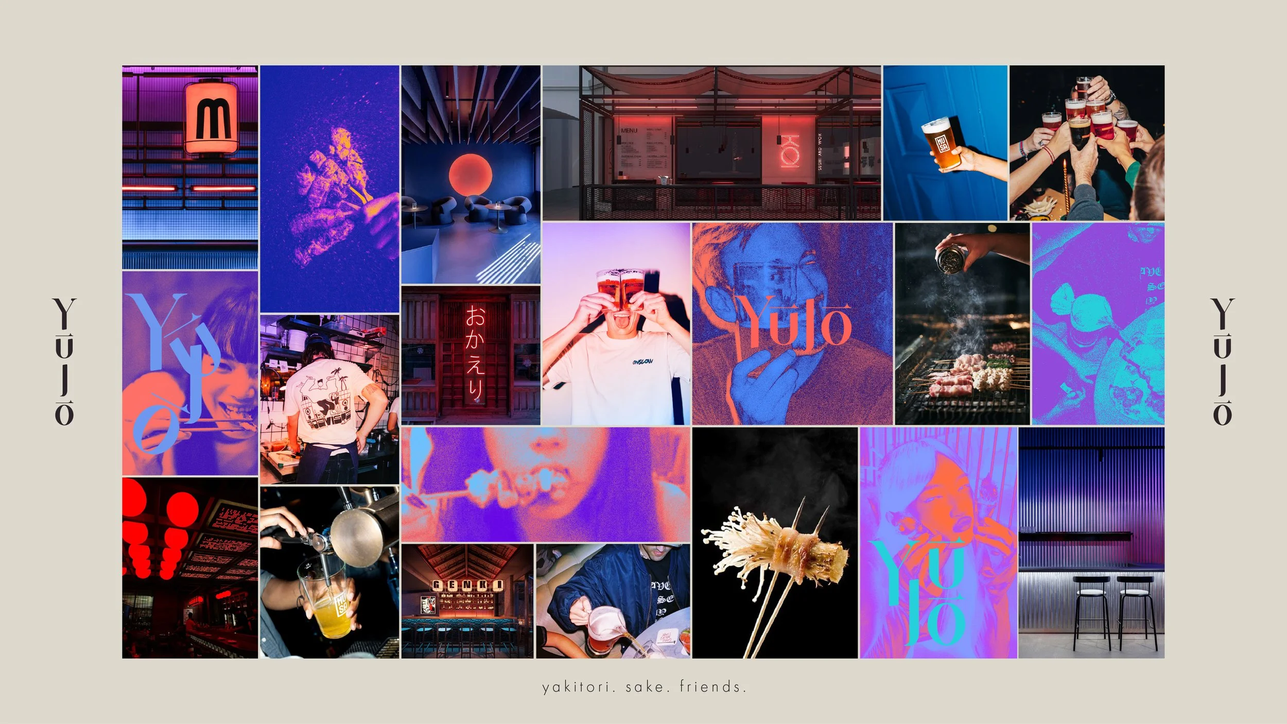
Not to copy how other restaurants looked, but to understand what kind of place Yujo wanted to become. I looked through traditional yakitori bars, modern restaurants, neighbourhood izakayas and contemporary dining spaces. Some felt refined. Some felt awkward. Some felt loud. Others felt quietly familiar.
After a while, I realised I wasn’t really studying restaurants anymore.
I was paying attention to three things:
the people
the shapes
the atmosphere
Those became the three lenses through which I understood the brand.
Three Things I Couldn’t Ignore
Originally, I thought I was searching for a visual style.
What I was actually searching for was the centre of the experience.
The people revealed how social the restaurant should feel.
The shapes hinted at a visual language that could feel generous, tactile and full of movement.
The atmosphere determined whether the identity should feel premium, playful, intimate or energetic.
Instead of one direction, these observations naturally grew into three creative territories.
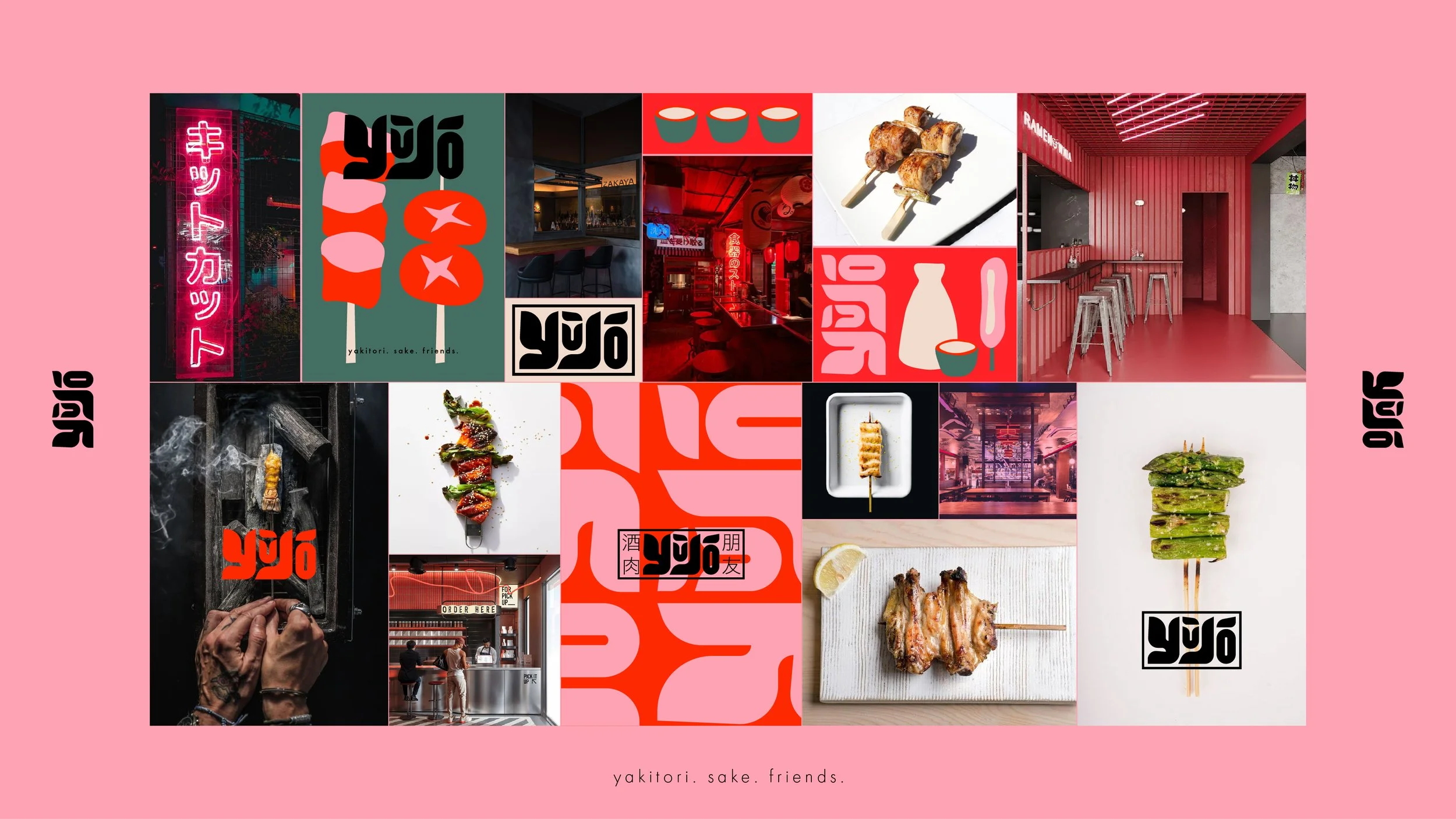
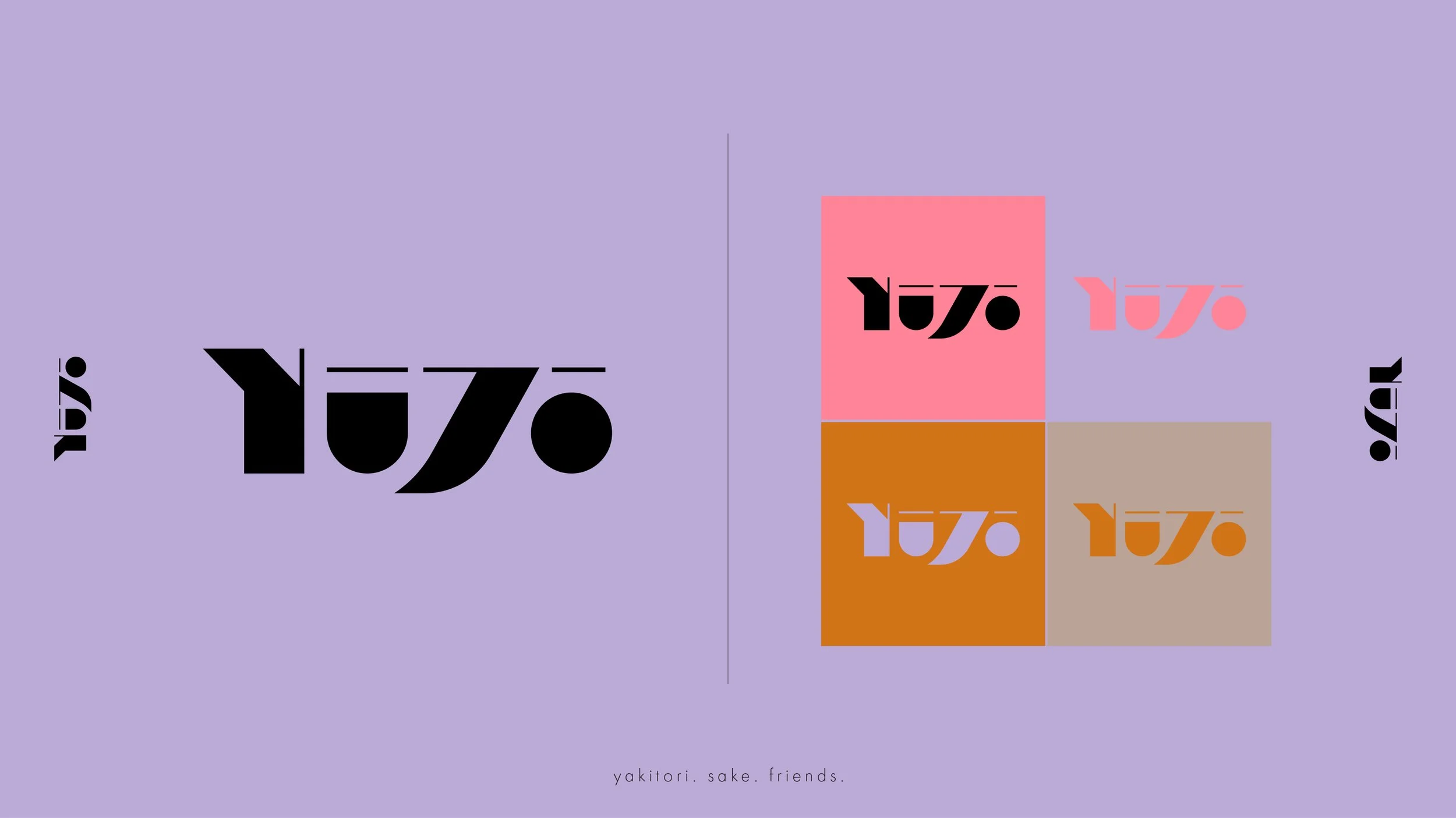
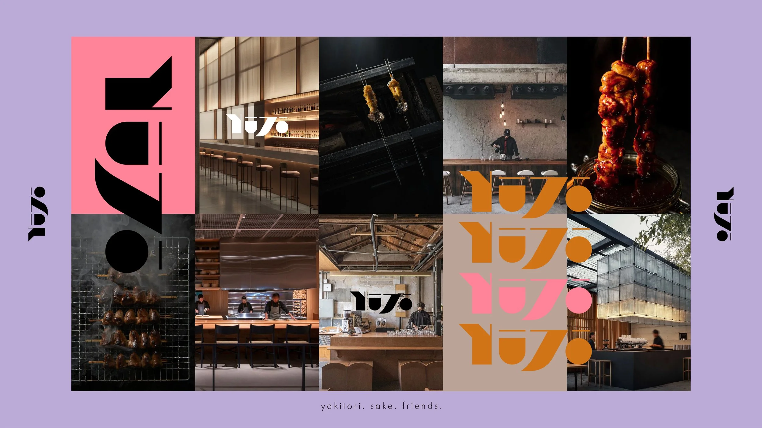
Neon Soul explored the city’s nightlife and energy.
Bold Bites celebrated the physicality of the food and the joy of sharing it.
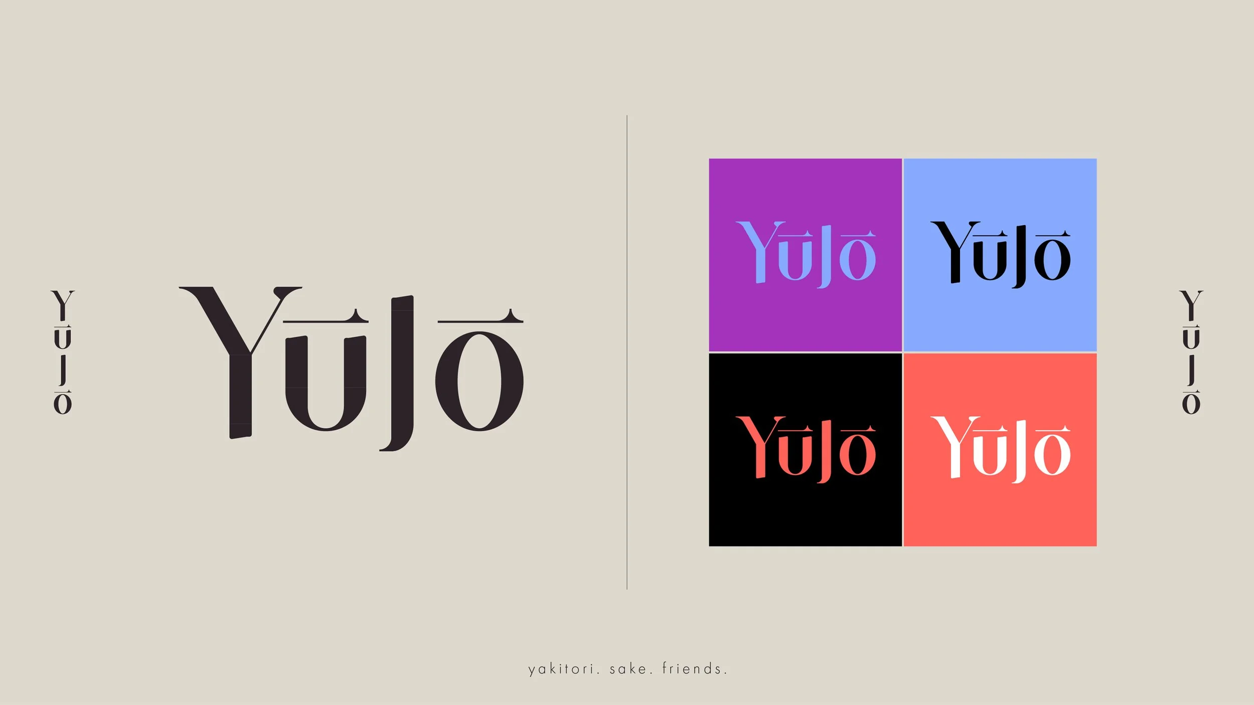
Modern Ritual looked at Japanese dining traditions through a quieter, more contemporary lens.
One Idea, Many Decisions
After discussing the concepts with the client, Bold Bites immediately felt like the right home for Yujo.
Everything afterwards became much easier.
Instead of designing individual assets, every decision came from one central idea.
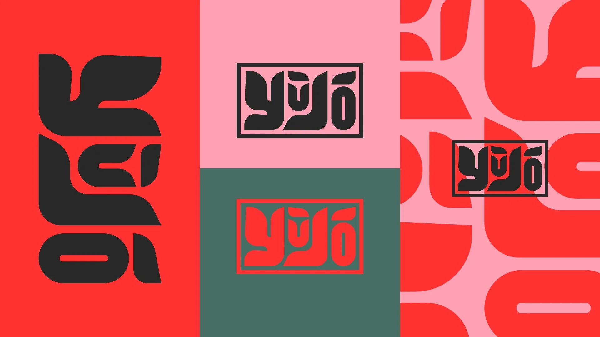
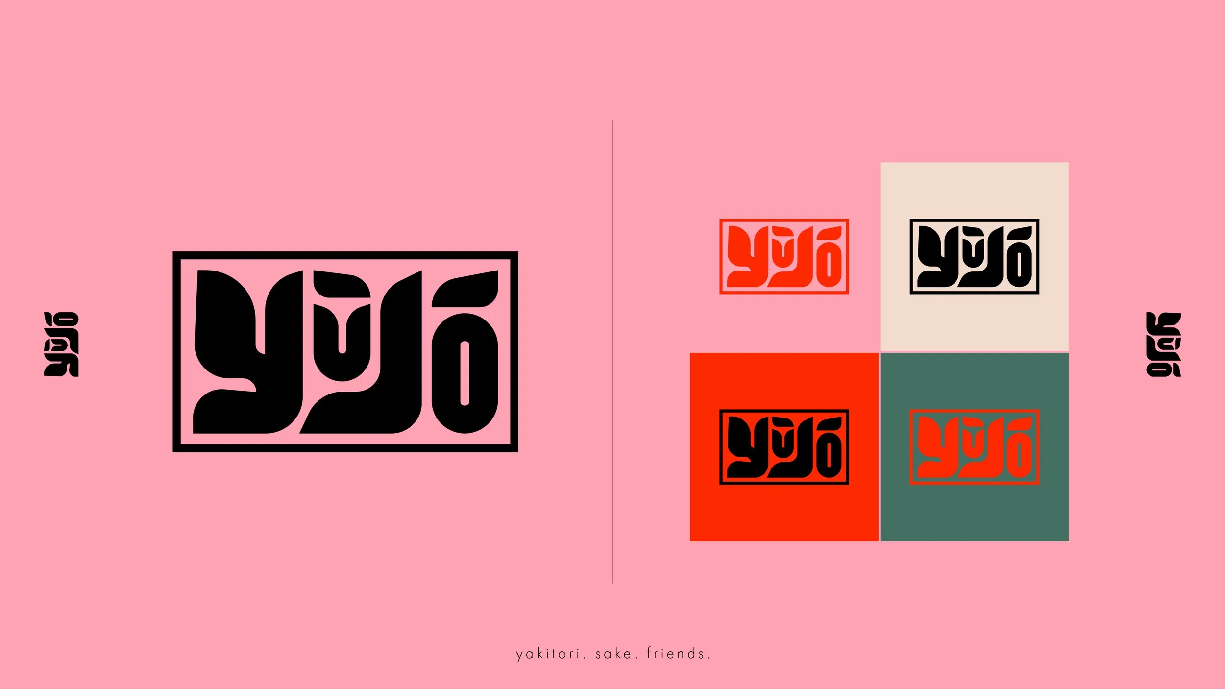
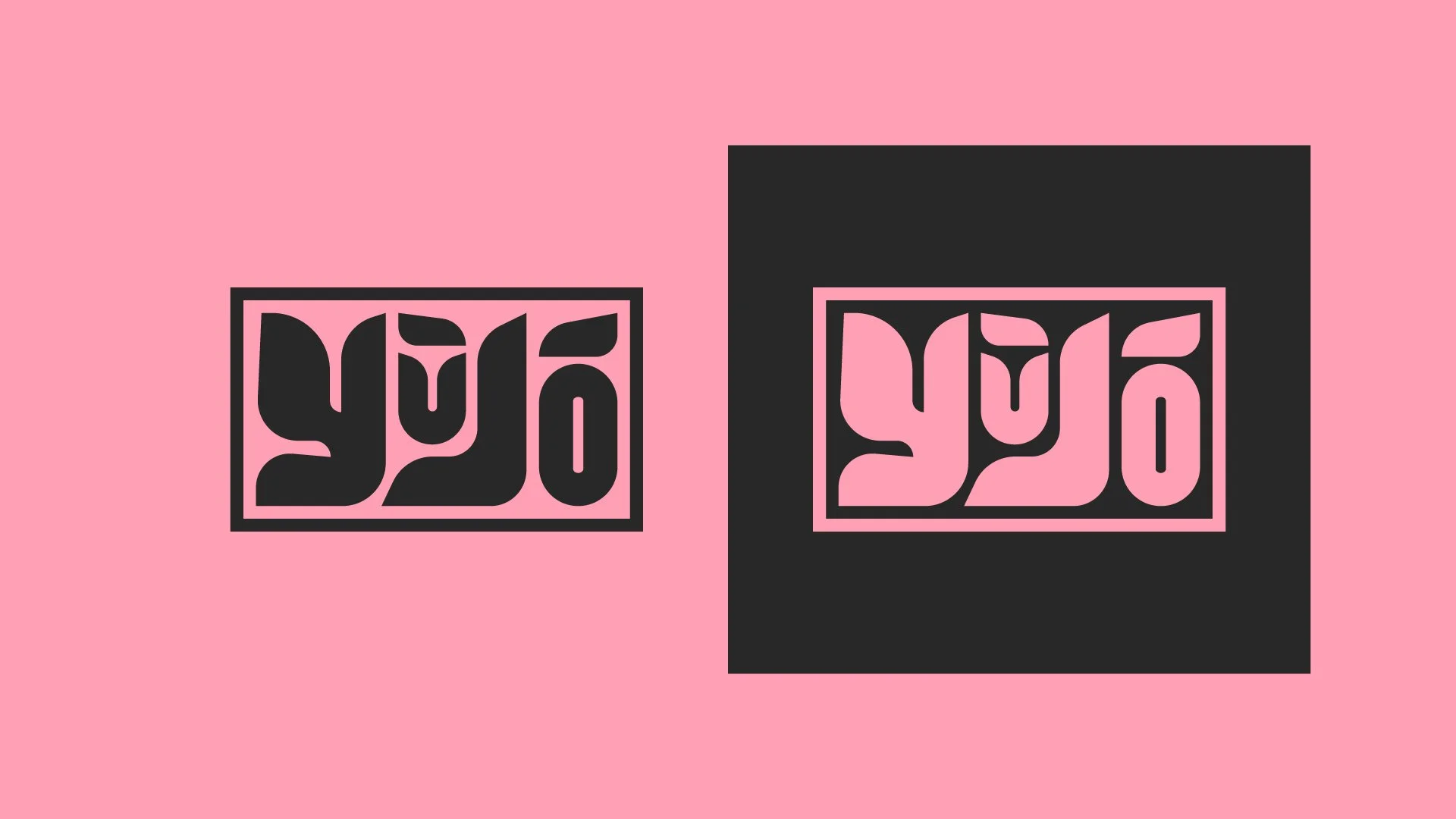
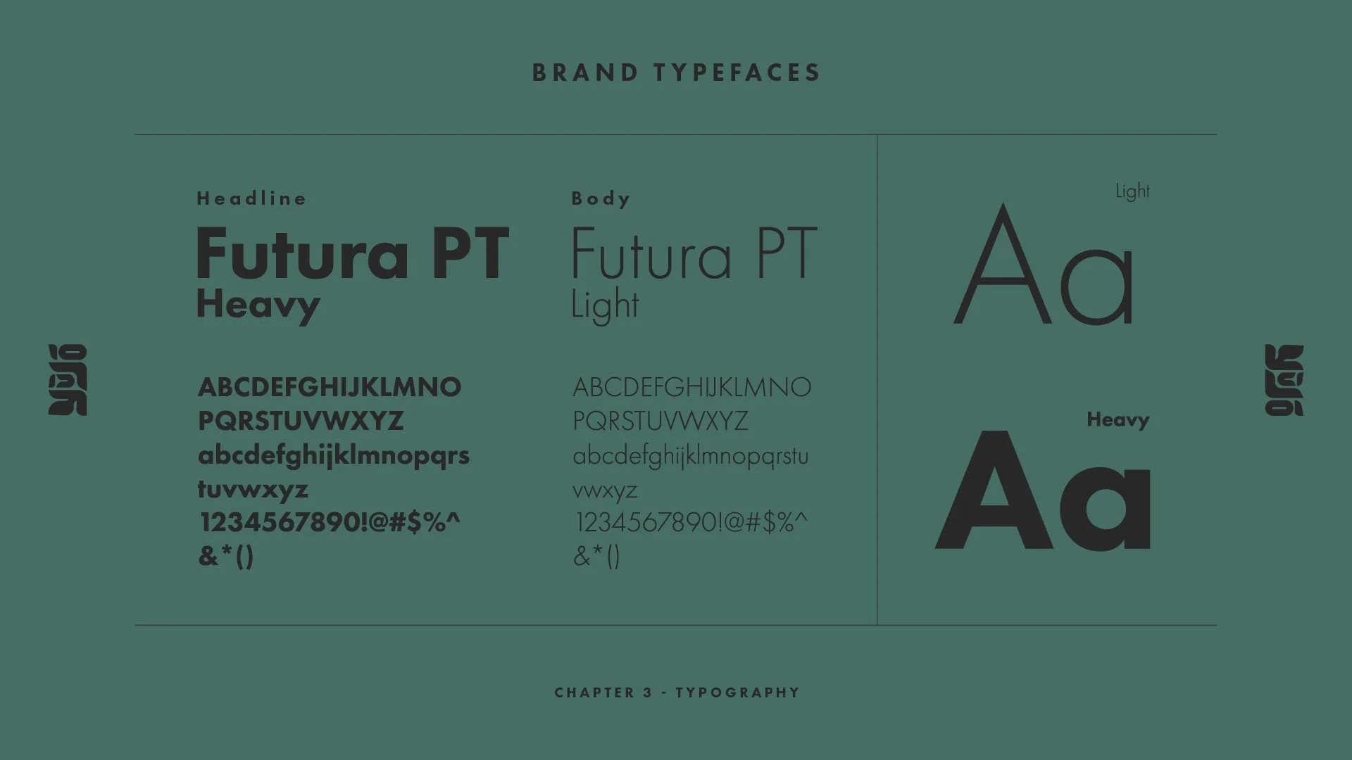
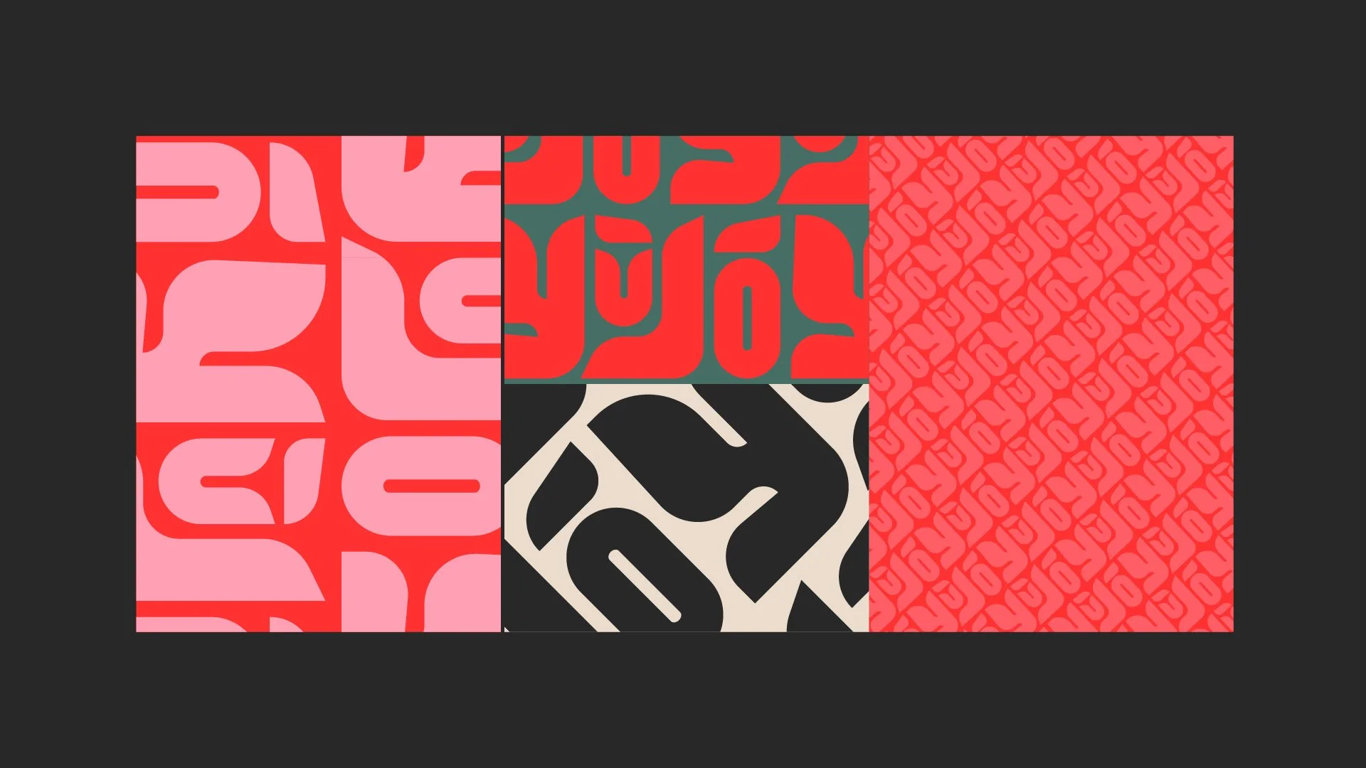
The typography became chunky and expressive, inspired by the confidence of brush strokes but softened into something more approachable.
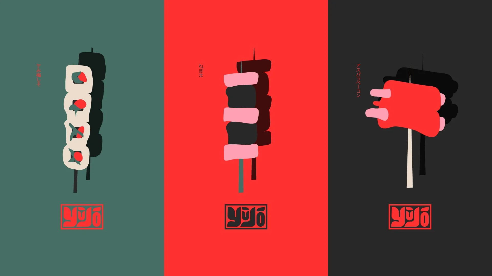
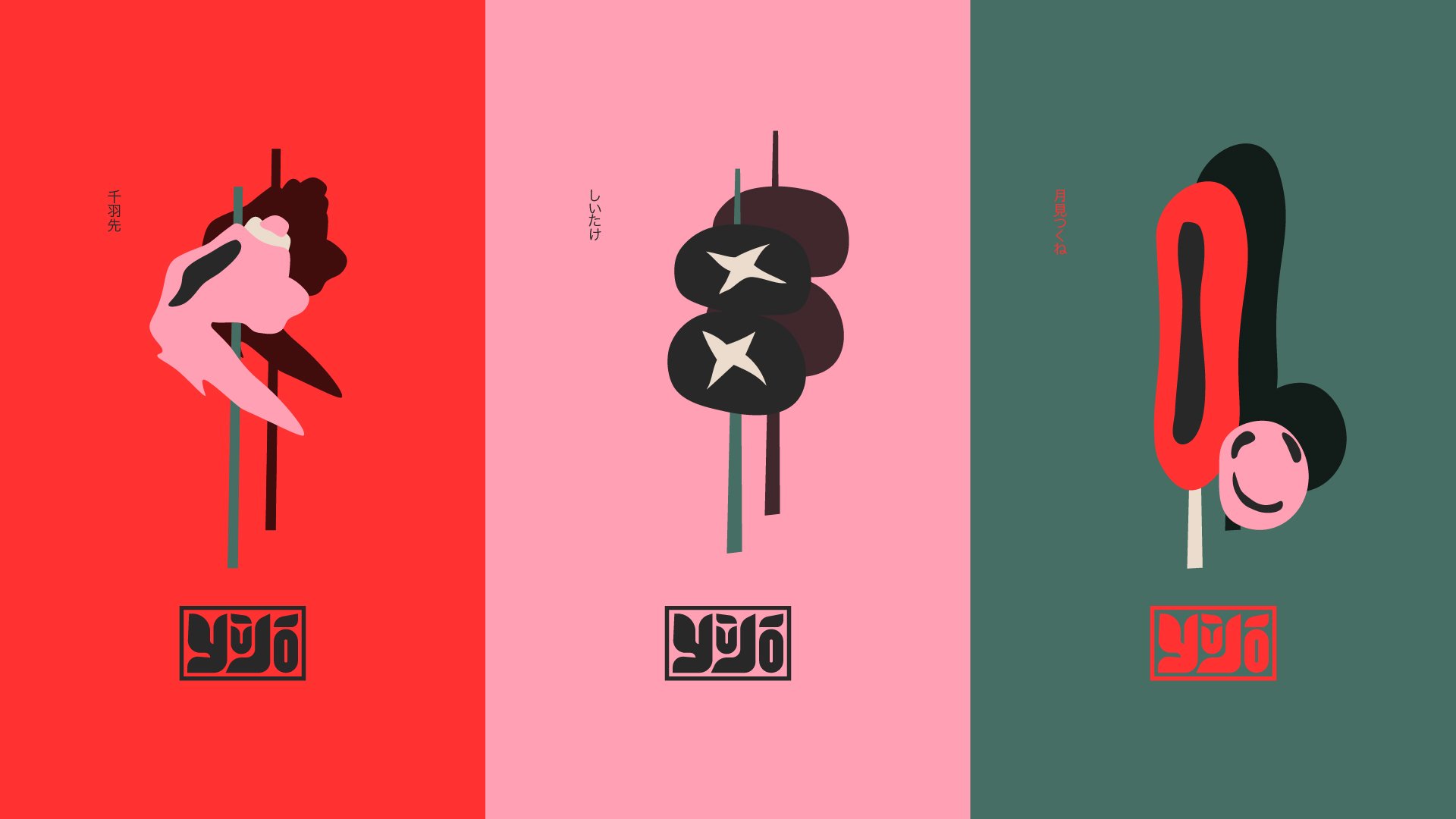
Simple geometric forms echoed skewers, sake cups and grilled ingredients without becoming literal illustrations.
Bright colour blocking created energy without relying on decorative Japanese clichés.
The system was designed to feel social before it felt premium.
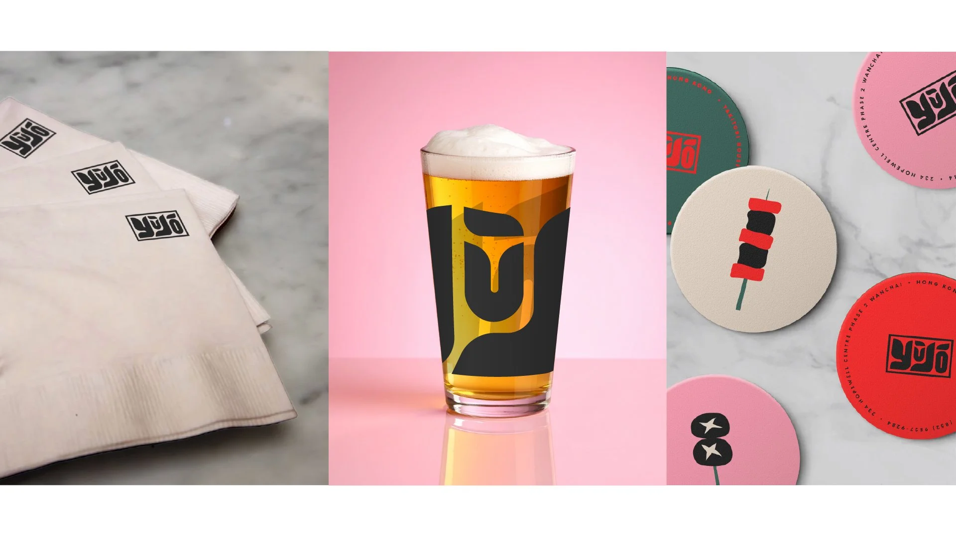
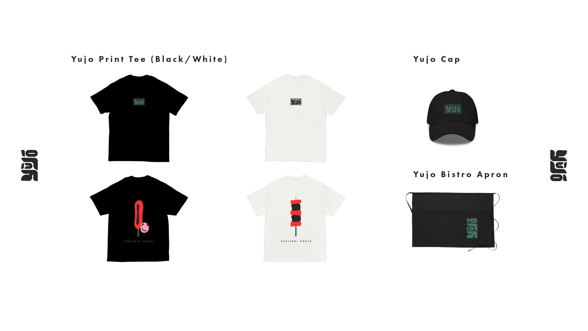
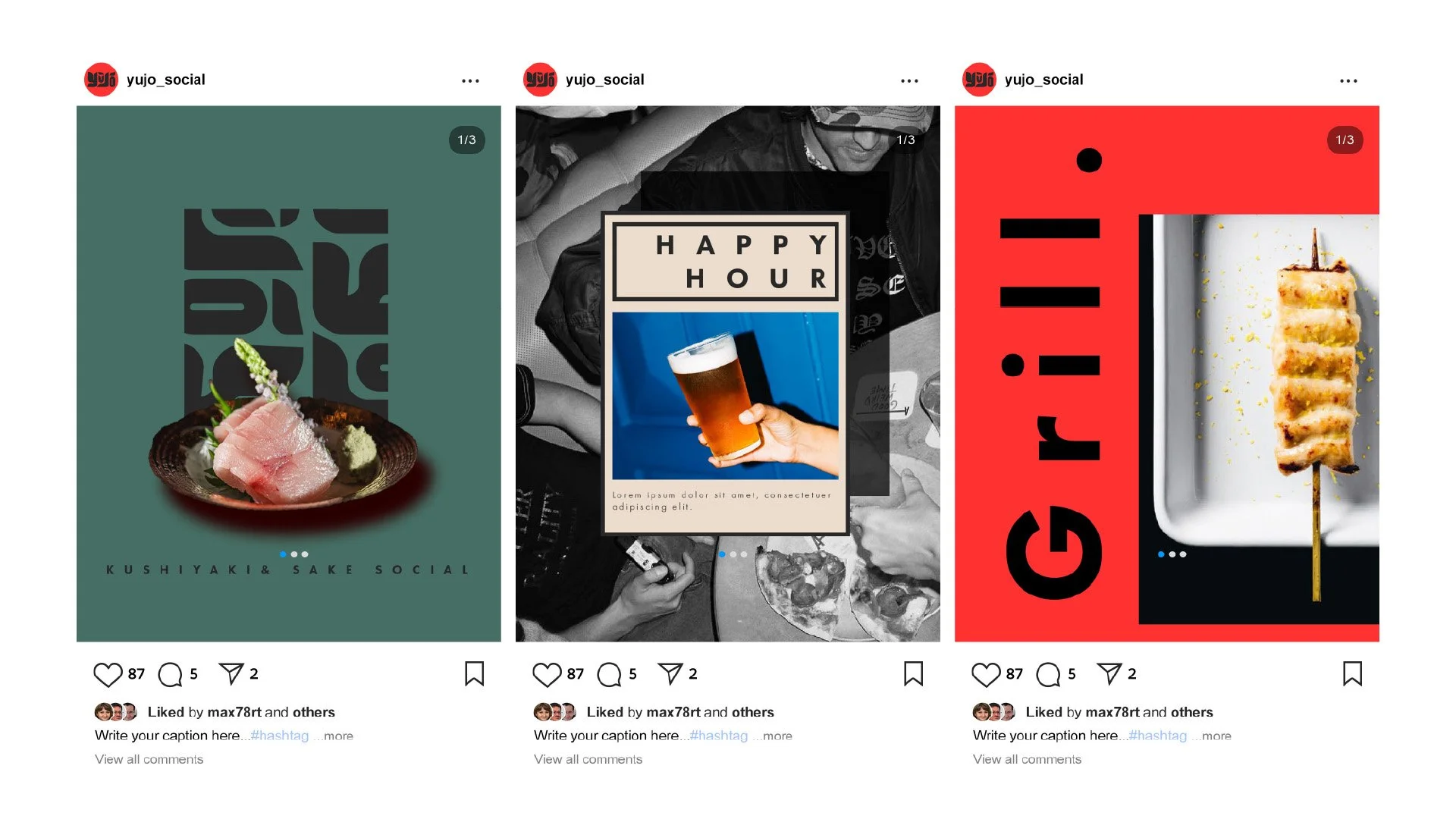
Whether it appeared on menus, coasters, staff T-shirts or Instagram posts, it should feel like the same place inviting people to sit down, order another round and stay a little longer.
Beyond the Logo
The final identity extended well beyond a logo.
It became a visual language that could move across every touchpoint of the restaurant—from menus and business cards to merchandise, signage, social media and printed materials.
Rather than decorating the restaurant, the identity helped define its personality: warm, confident, slightly playful, and built around the experience of gathering over good food.

Afterwards
This project reminded me that I rarely find ideas by looking at design.
I find them by paying attention.
The strongest creative direction usually isn’t hidden inside mood boards or trend reports. It’s already present in the business itself—you just have to notice what keeps pulling your attention.
For Yujo, it wasn’t the logo that came first.
It was the people sitting around the table.